St. Louis
Bagel Co.
Project Type: Logo design
Date: Fall 2024
Software:


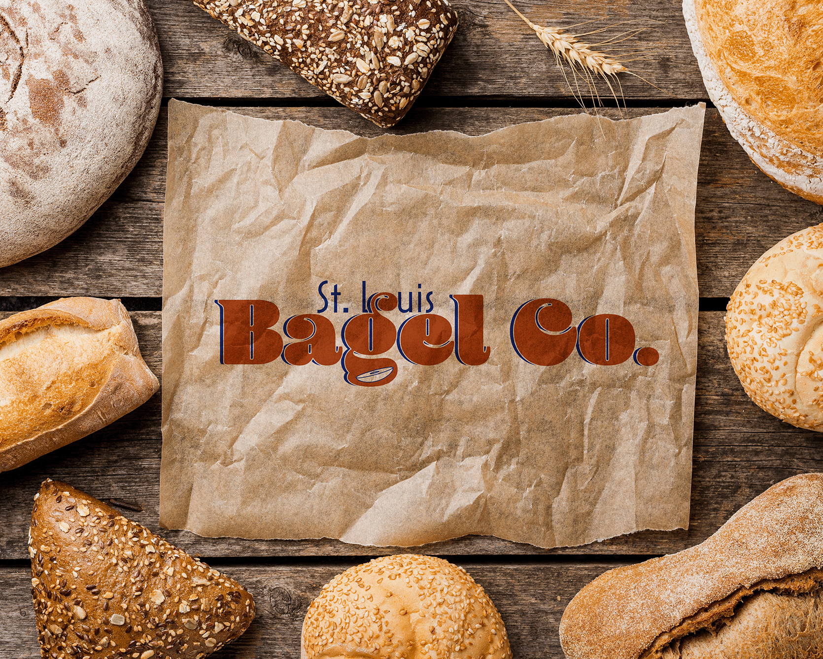
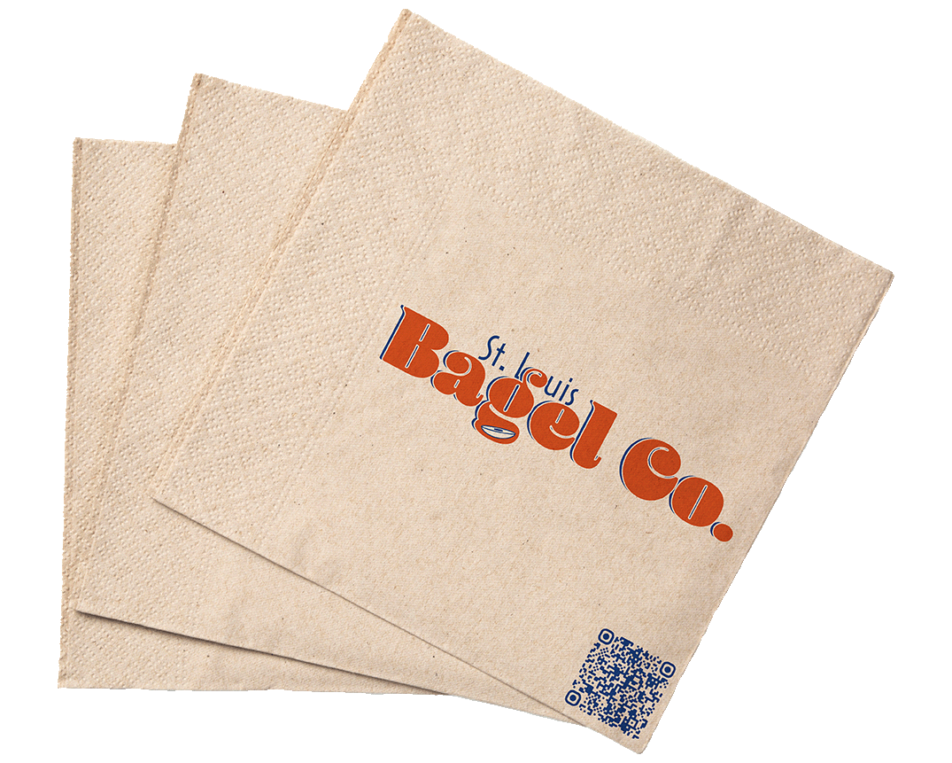
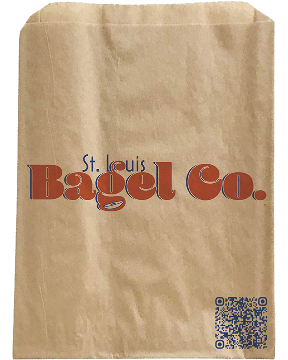
The logo for St. Louis Bagel Co. is a clean, contemporary wordmark that captures the spirit of the city and the comfort of a freshly toasted bagel. The design features bold, rounded typography with a playful twist - a small, stylized bagel icon tucked into the counter of the lowercase "g." This subtle detail adds personality while instantly conveying the brand's core offering.
The color palette blends a deep, toasted orange inspired by the perfect bagel crust with a rich, dark blue drawn directly from the St. Louis city flag as a nod to local pride and authenticity. Together, these colors create a striking and memorable contrast that feels both modern and rooted in tradition.
This versatile identity works seamlessly across applications, from cart signage and menus to merchandise and digital media, ensuring that St. Louis Bagel Co. is always serving up strong visual flavor alongside its signature baked goods.