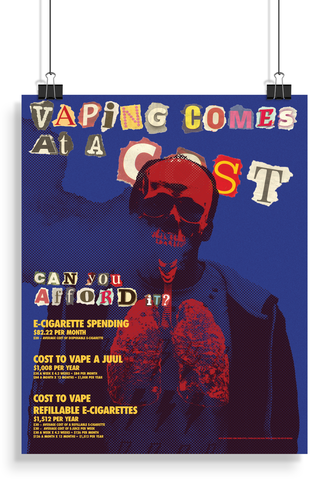
This anti-vaping PSA poster addresses vaping through the lens of financial loss, using cost-focused language to draw viewers in while confronting them with the health consequences of vaping through imagery. The text emphasizes the cumulative monetary expense of vaping, framing it as money wasted over time, while the visuals reference the physical toll vaping takes on the body.
Using the overlay poster design strategy outlined in How Posters Work by Ellen Lupton, layered imagery is used to create visual tension. Health-related imagery sits beneath or intersects with the text, partially obscured but impossible to ignore, mirroring how the health risks of vaping are often overshadowed by its perceived affordability or convenience. This layered approach encourages the viewer to look closer and reconcile the disconnect between short-term financial decisions and long-term bodily consequences.
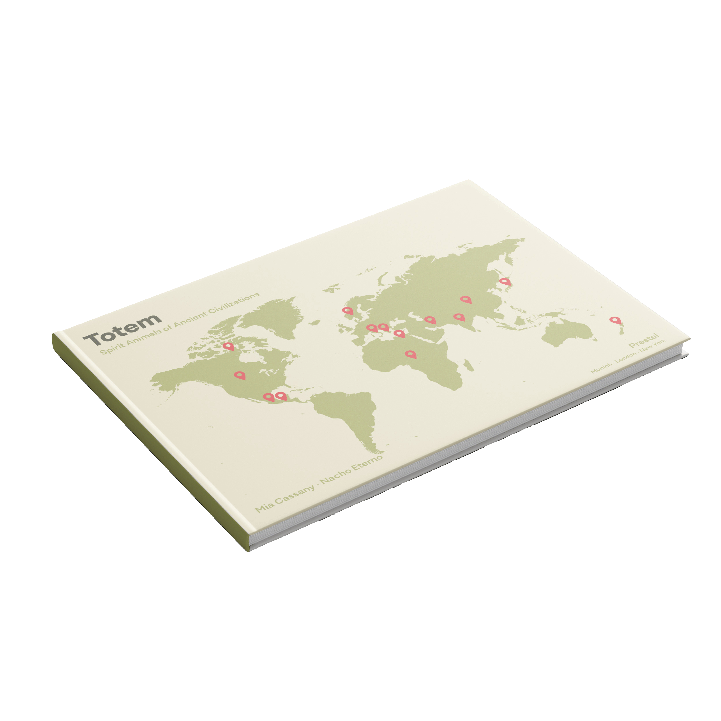
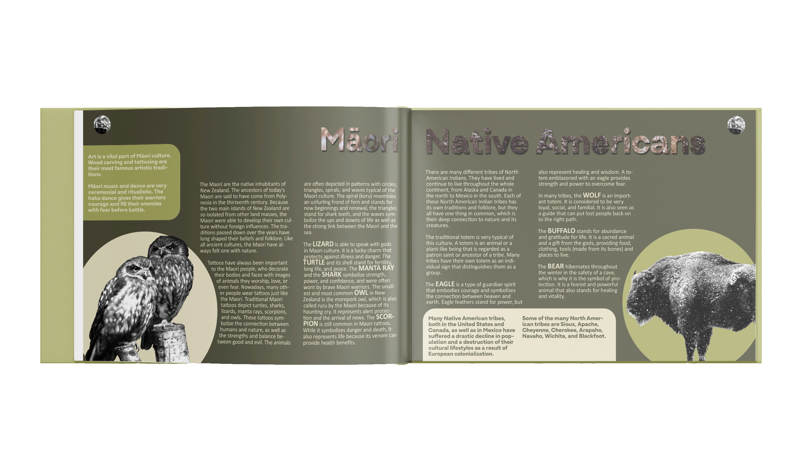
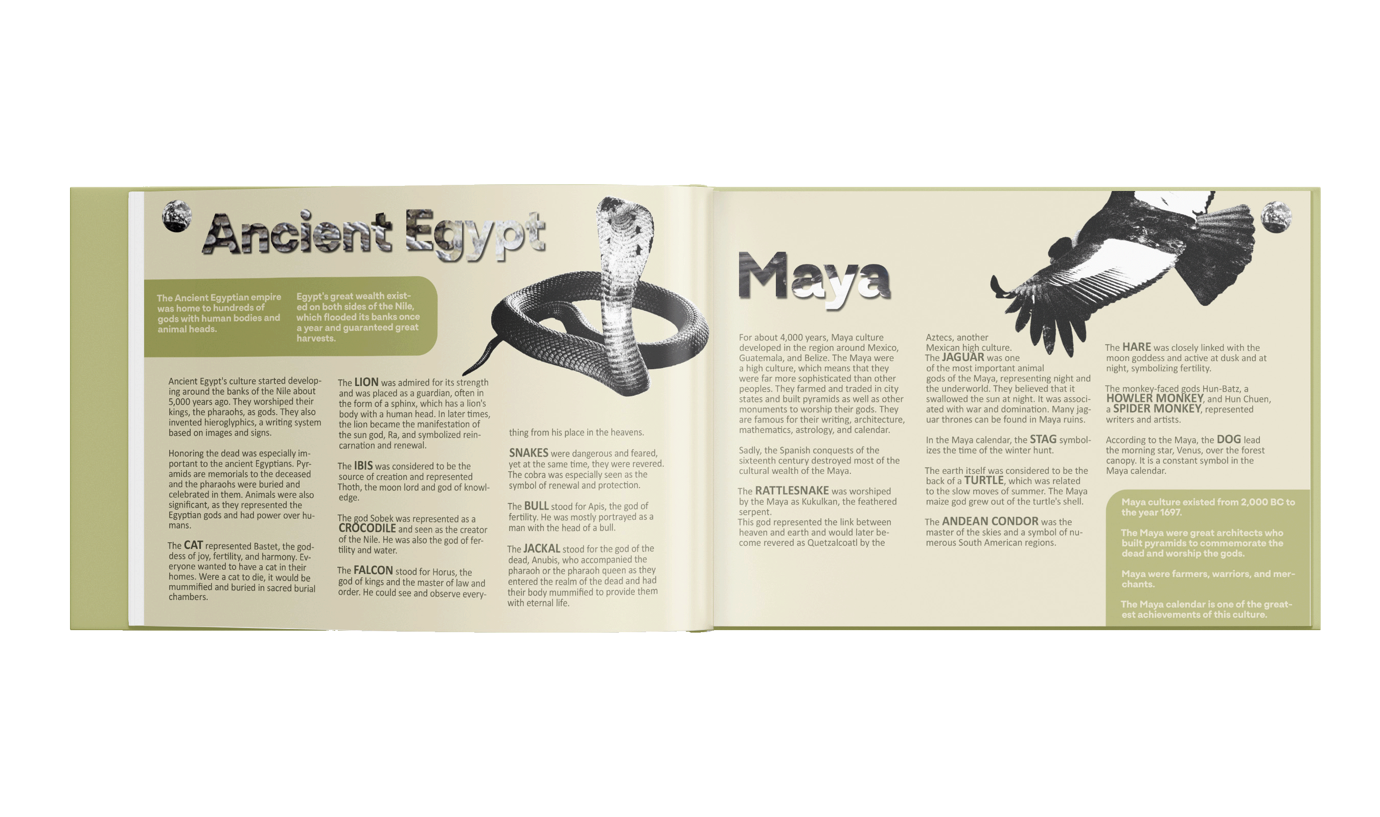
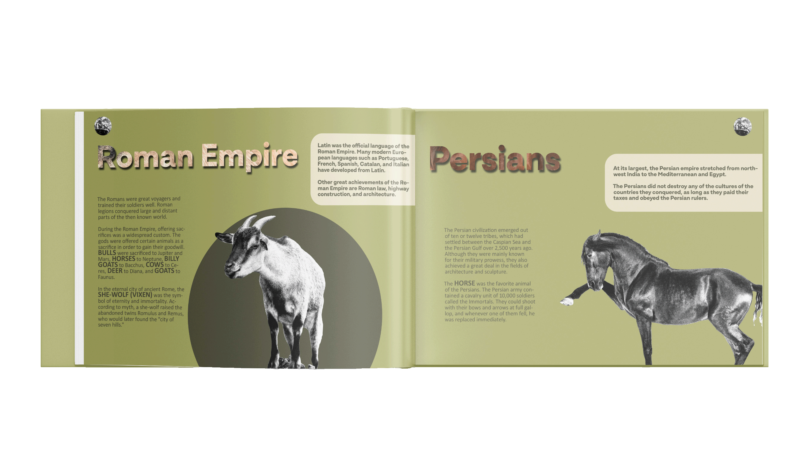
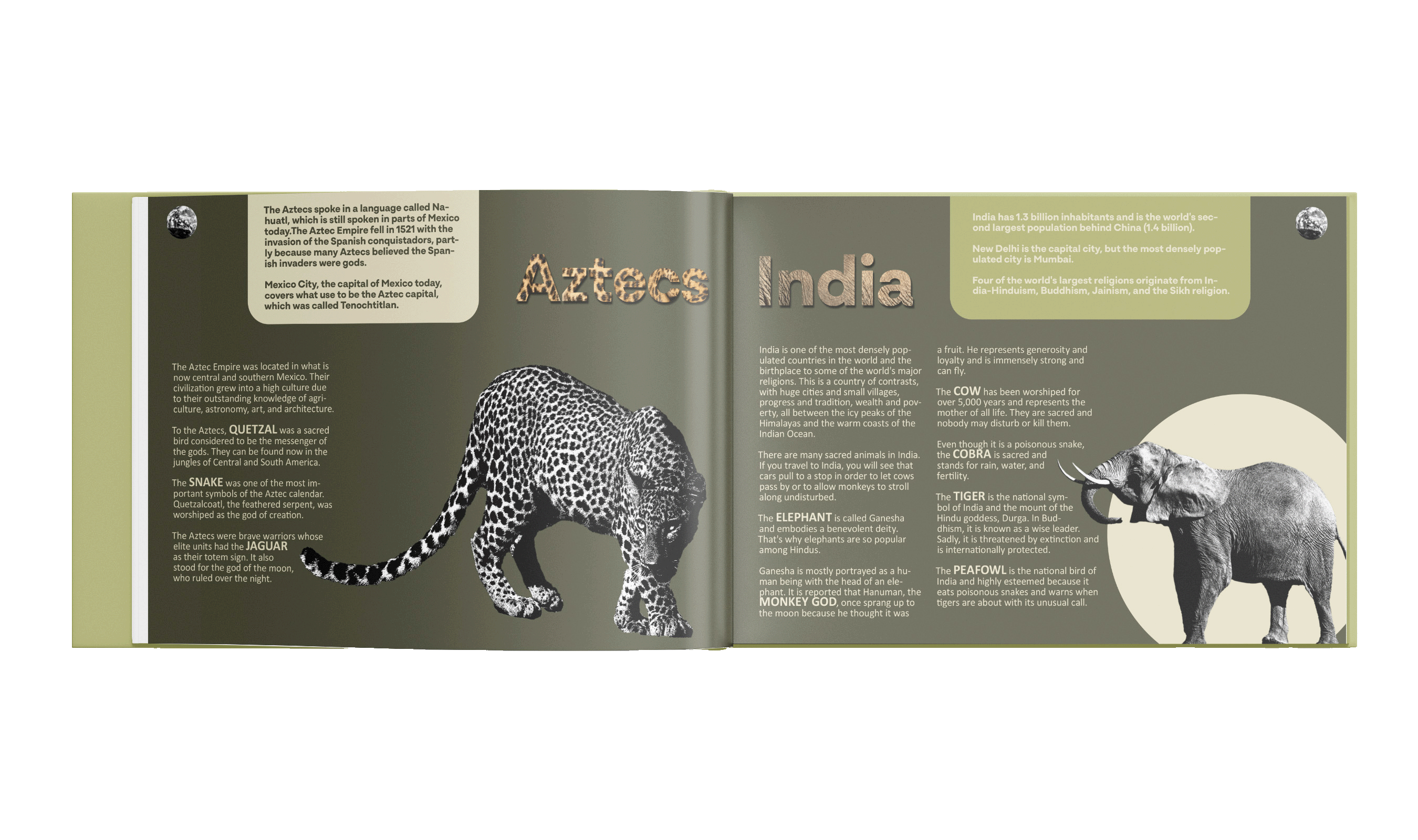
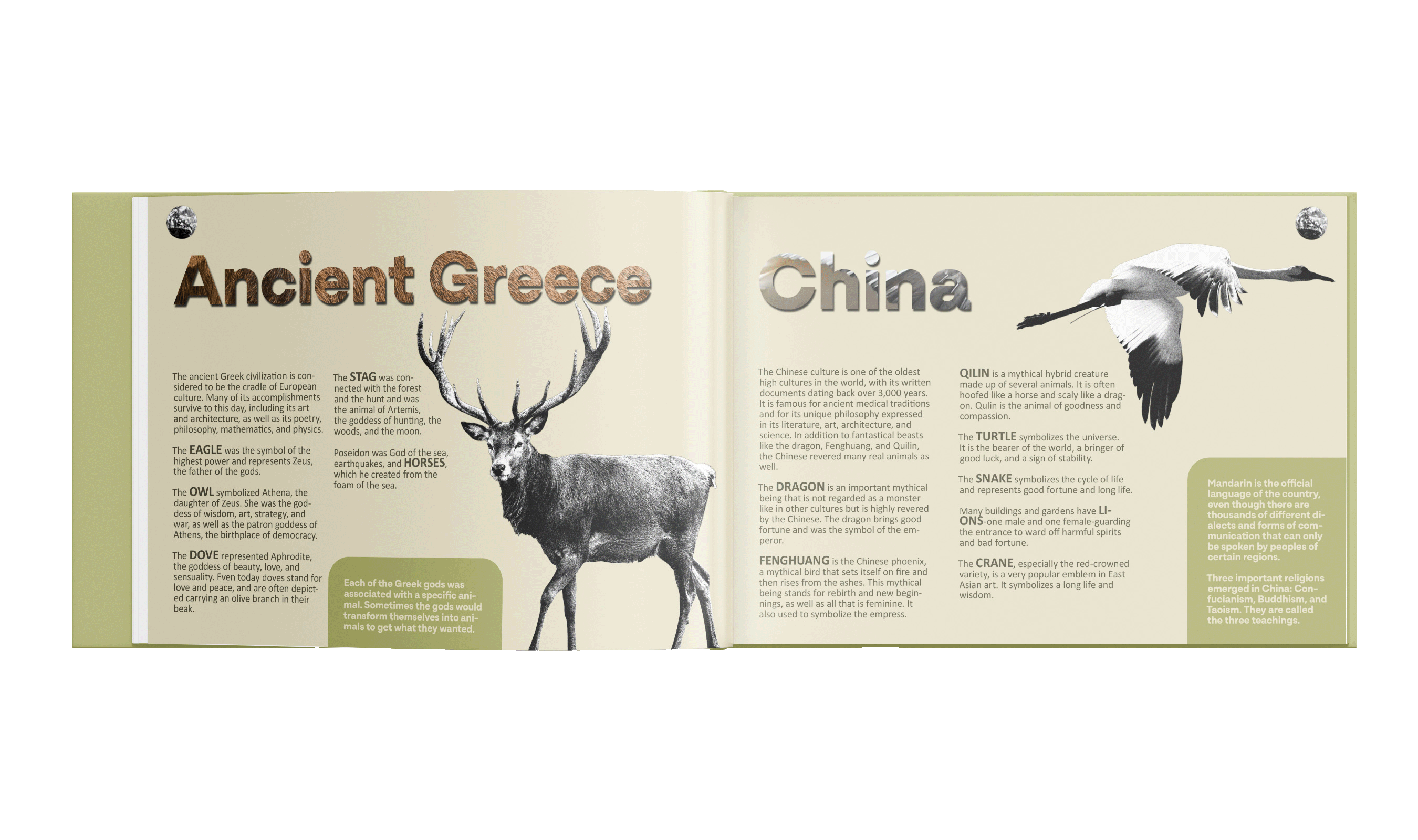
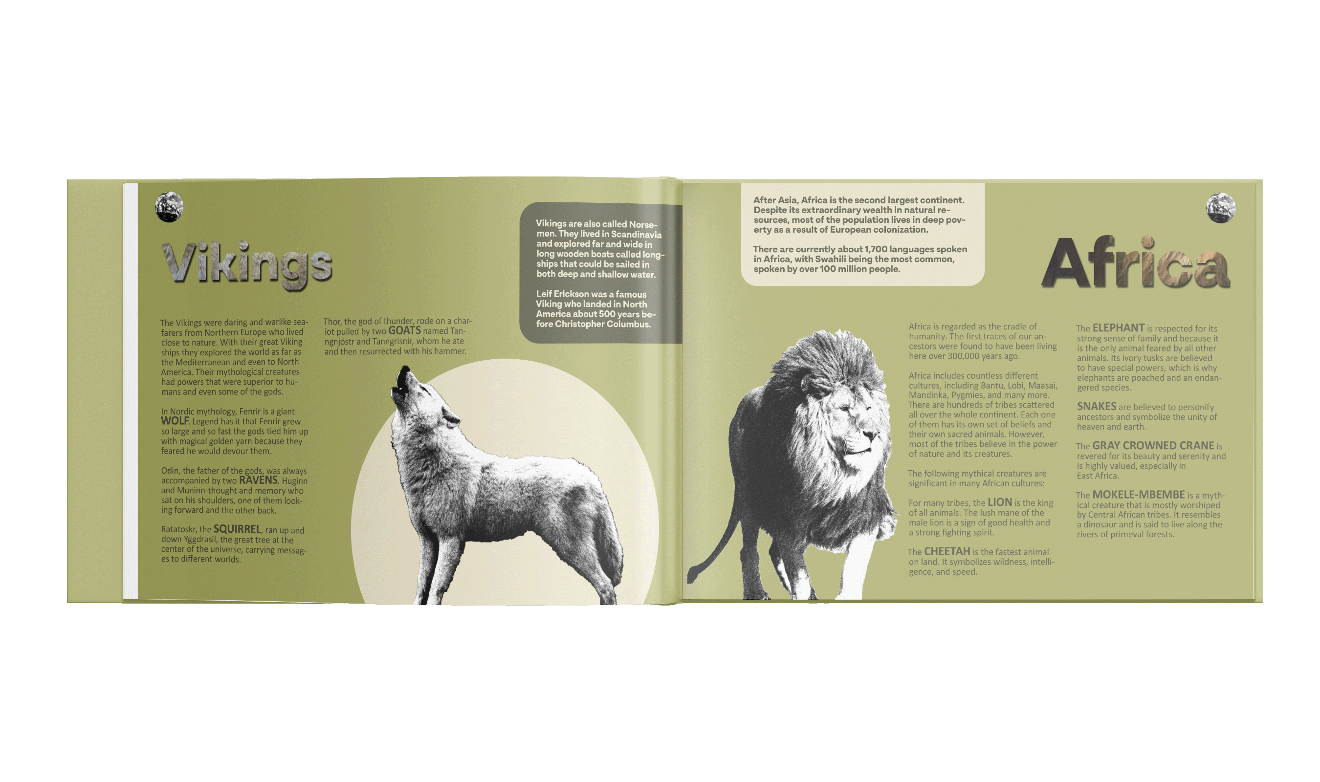
The redesigned layout for Totem: Spirit Animals of Ancient Civilization embraces a grounded, organic aesthetic that deepens the reader’s connection to the natural world. Earthy colors set the tone throughout, creating an immersive, calming visual experience that mirrors the landscapes where ancient civilizations once thrived.
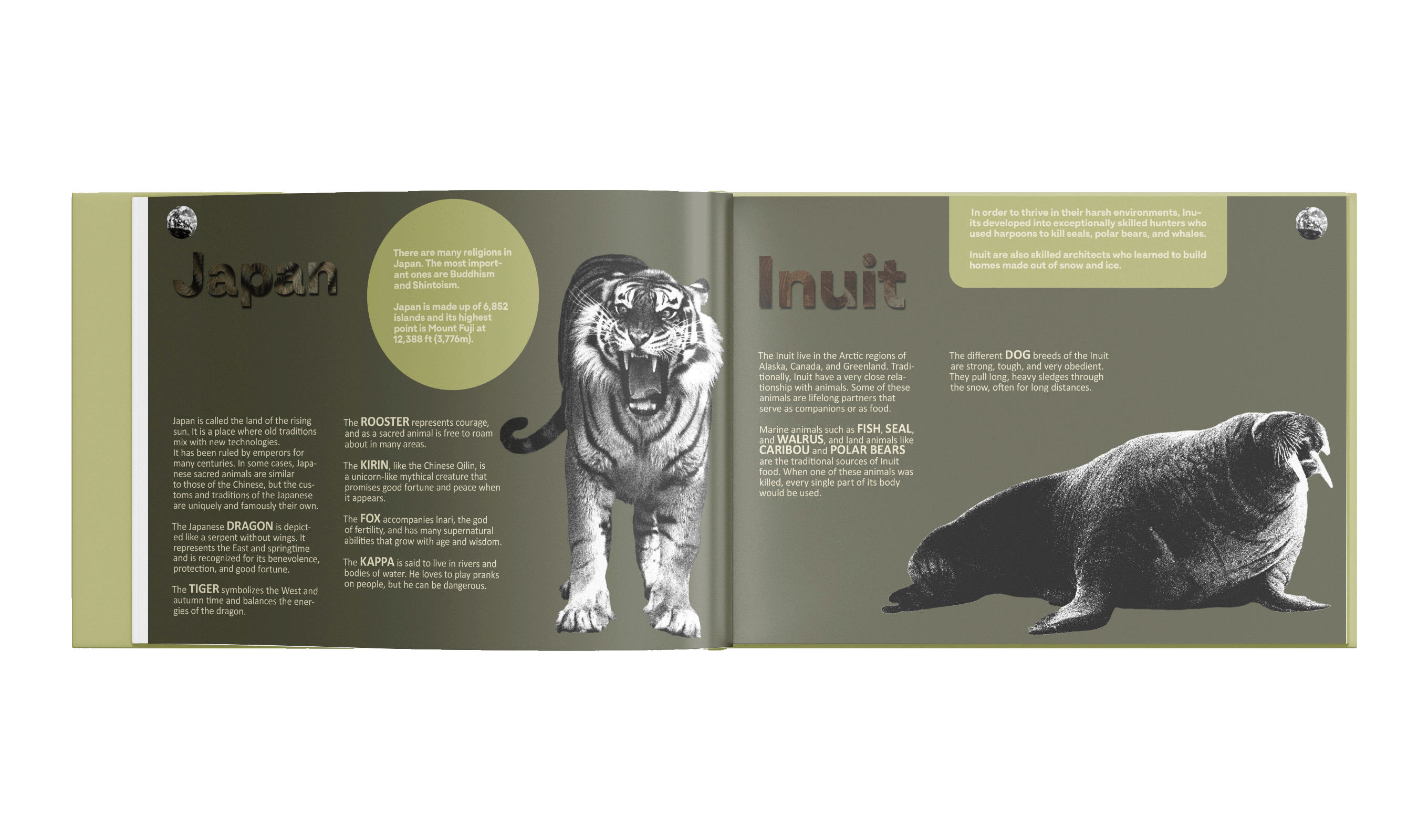
Real-life, high-resolution animal photography replaces stylized illustrations, bringing an authentic and tactile quality to each totem animal. These images are presented with minimalistic frames and generous white space, allowing the natural textures of fur, feathers, and scales to breathe and captivate the reader.
This redesign transforms Totem into a richer, more sensory experience, one where history, mythology, and nature come alive in every detail.
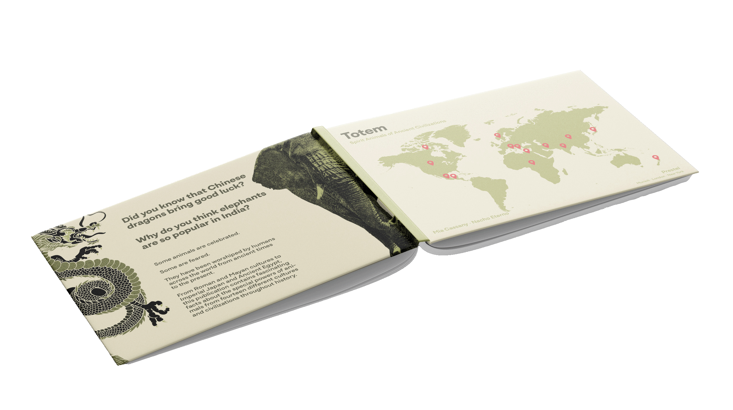
Click here to view the book in full.
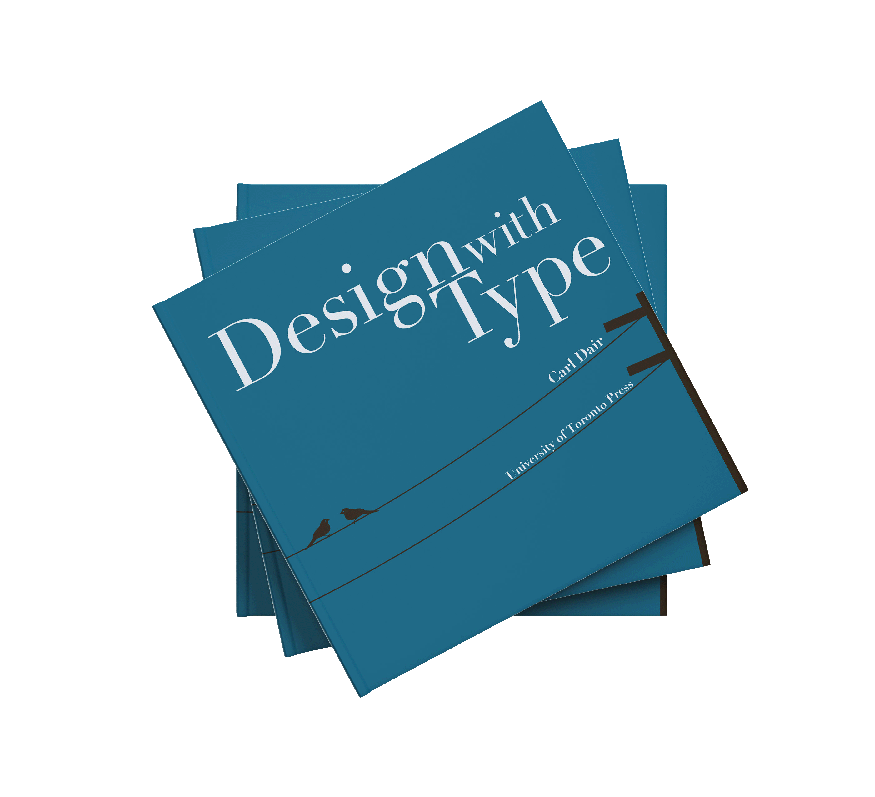
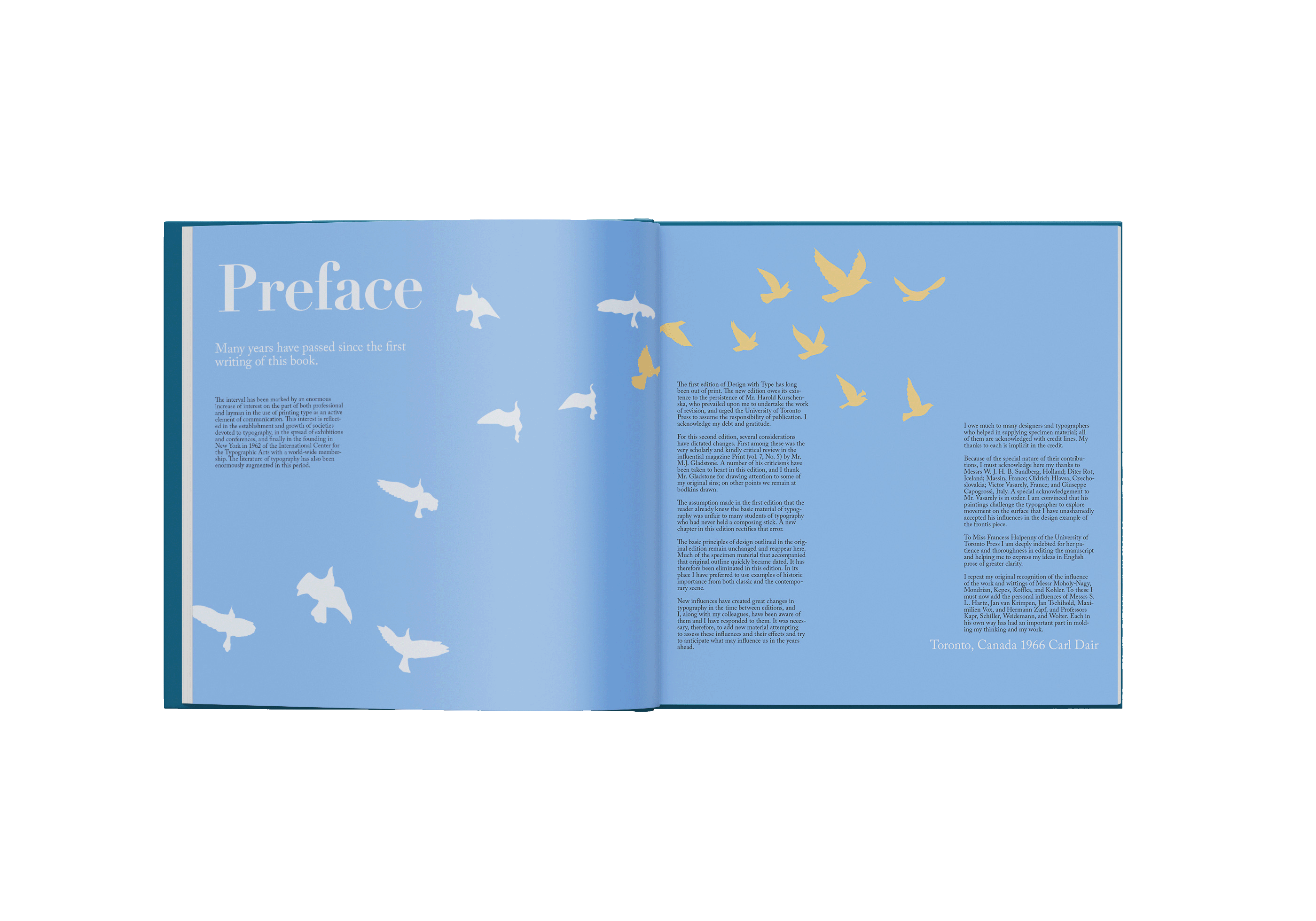
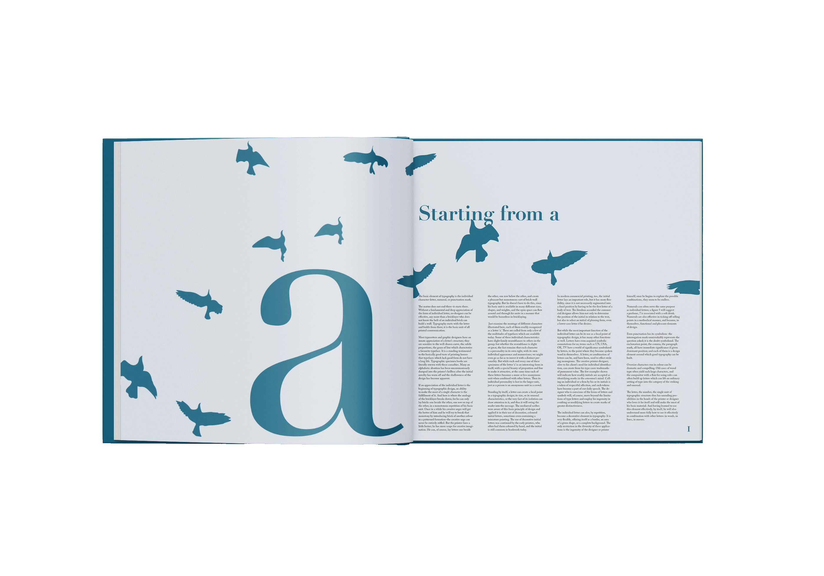
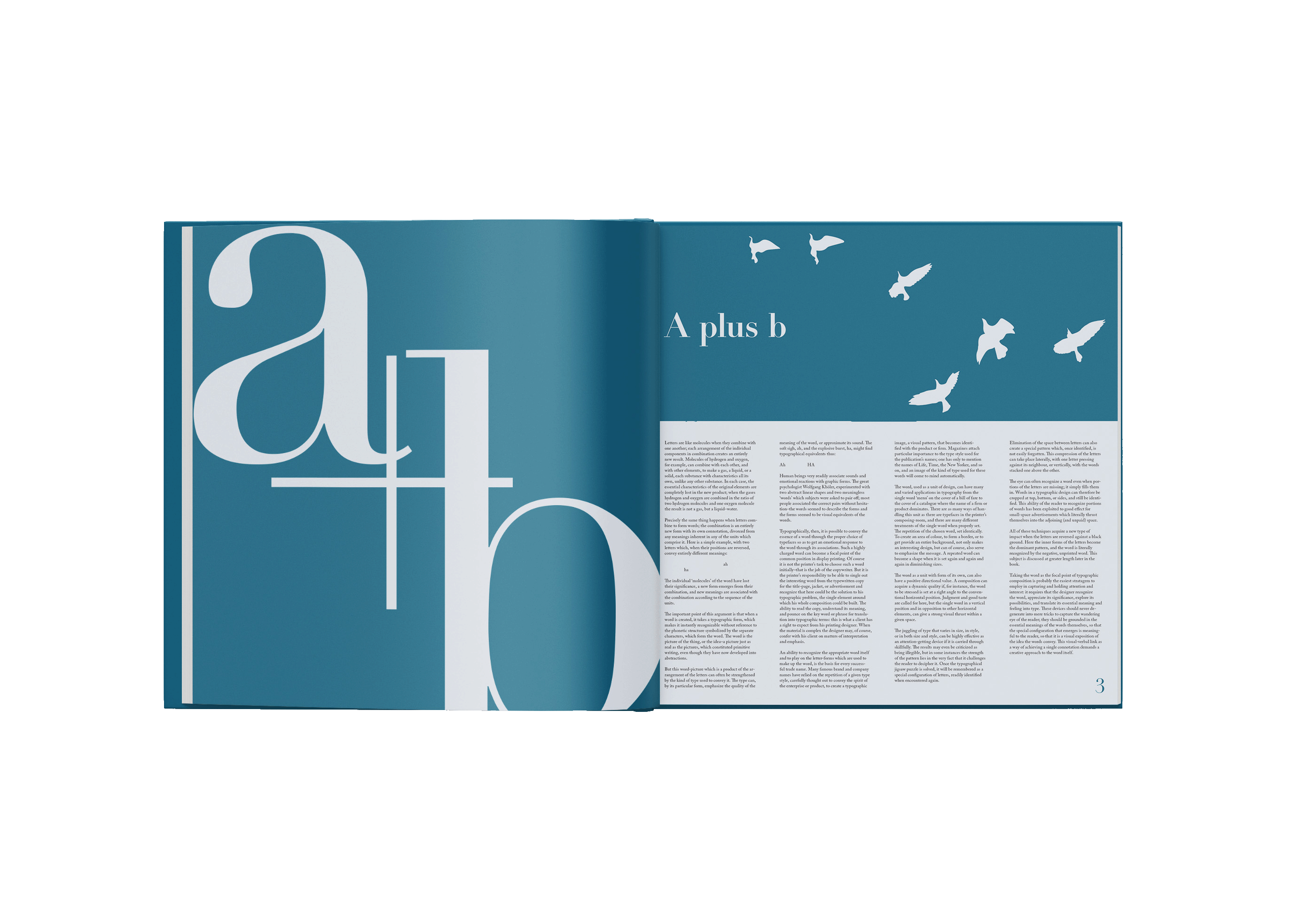
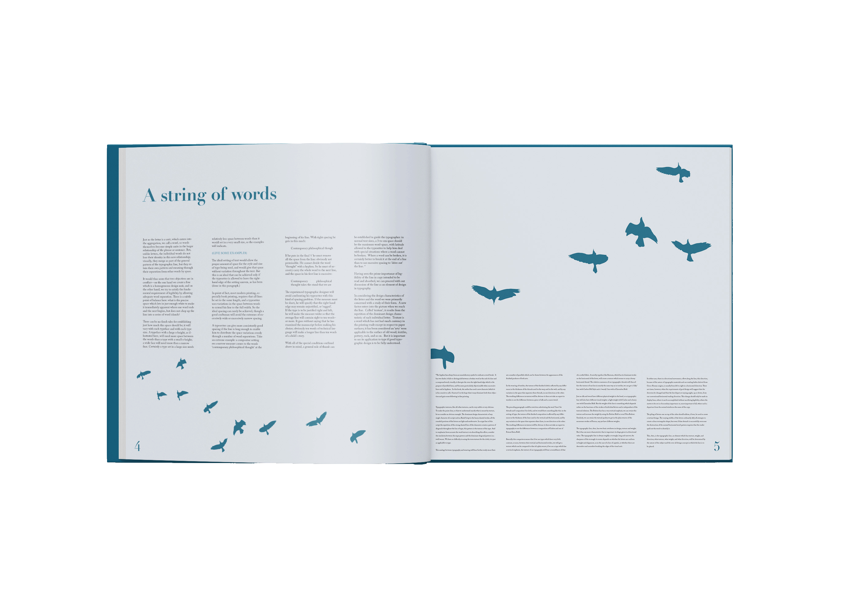
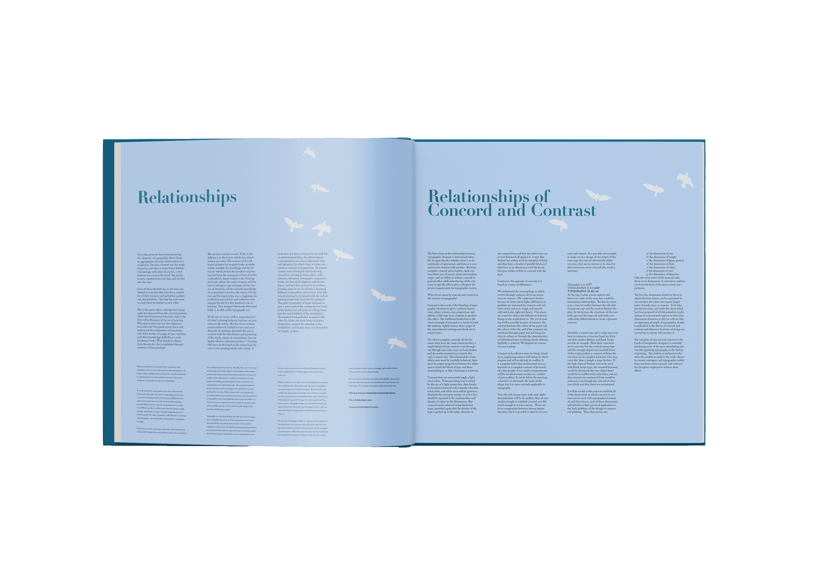
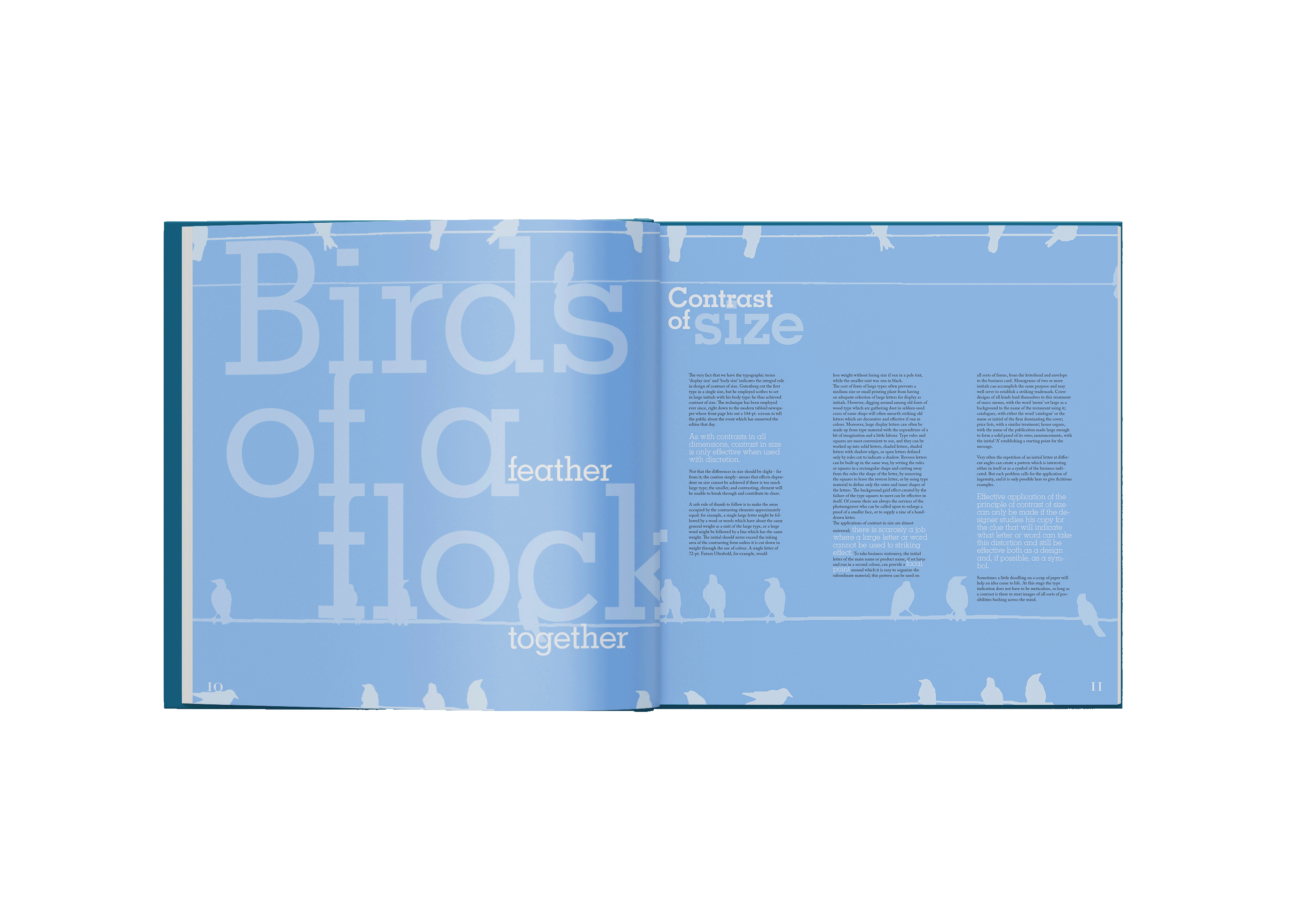
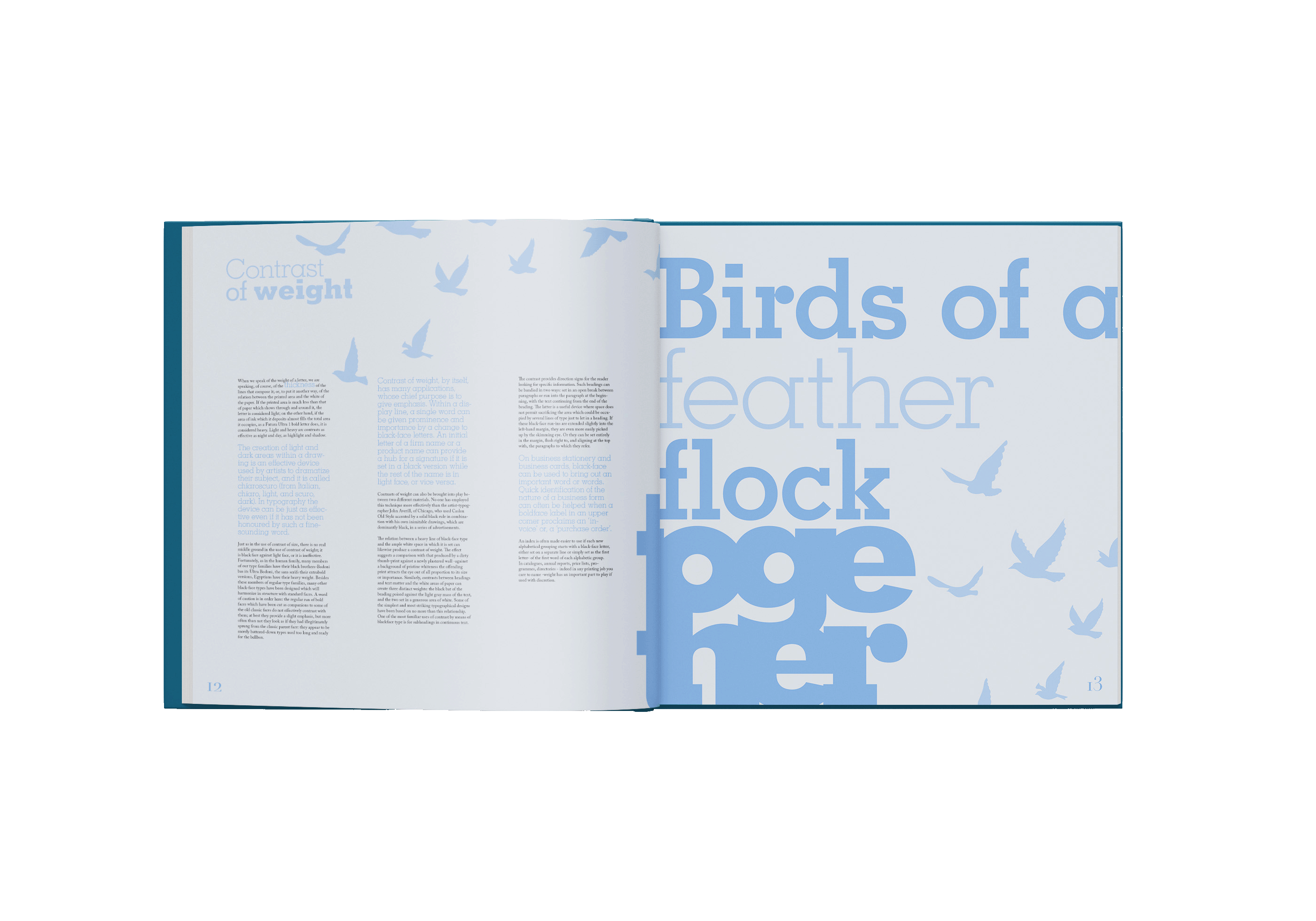
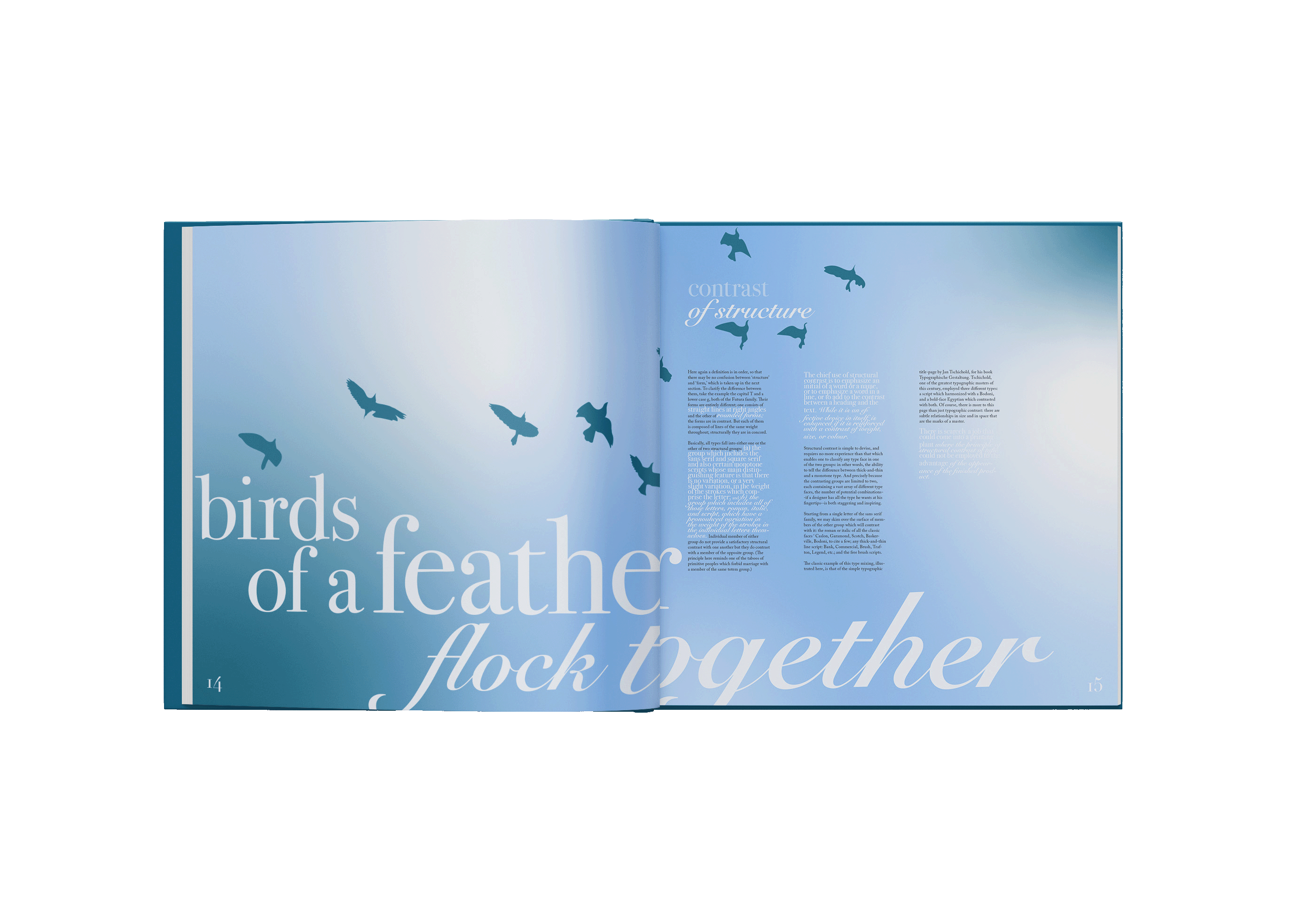
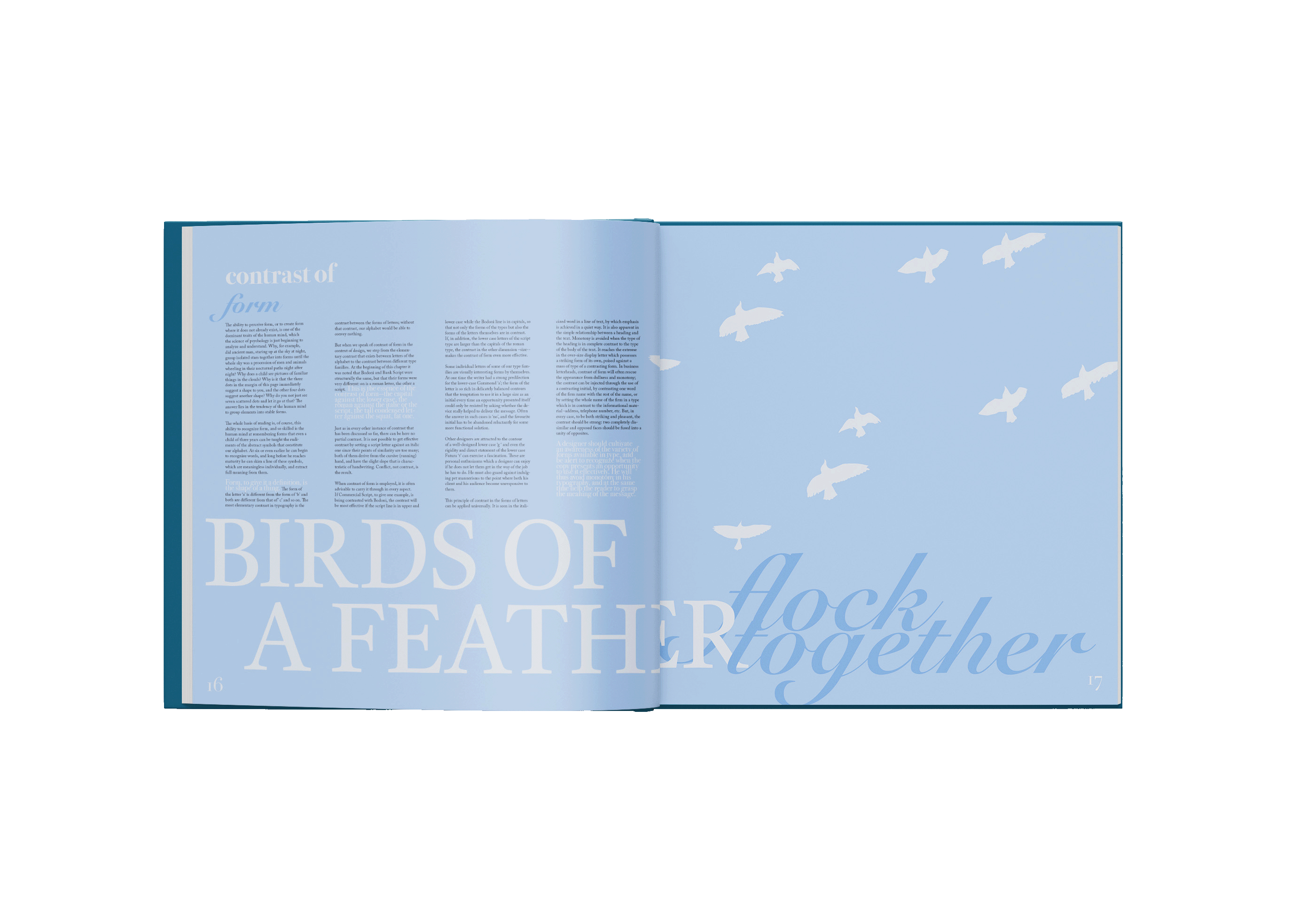
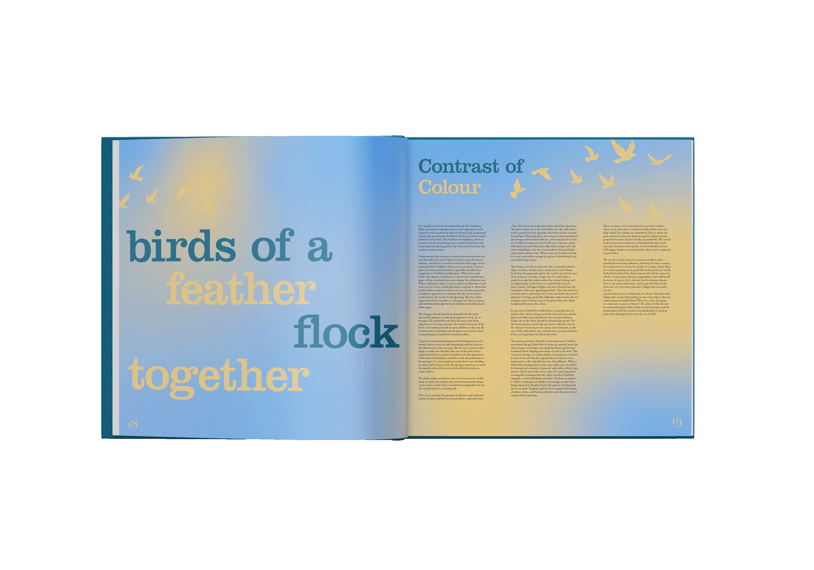
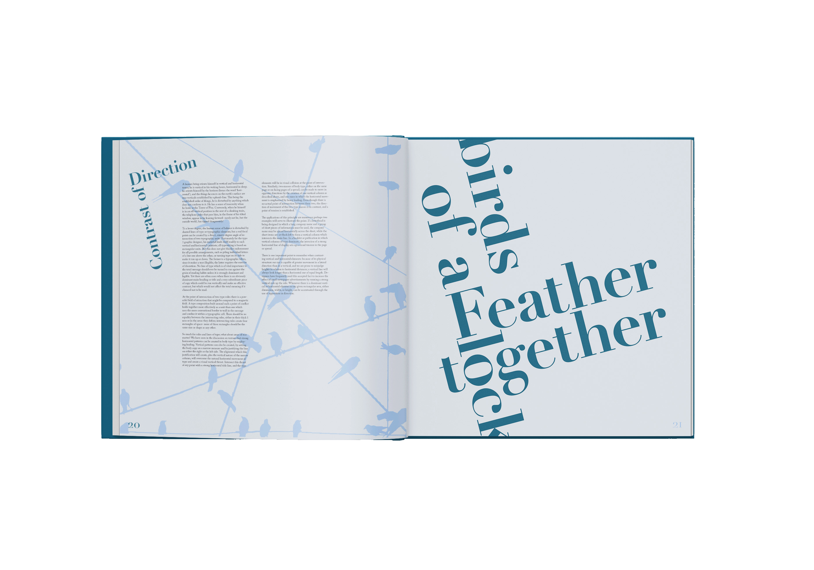
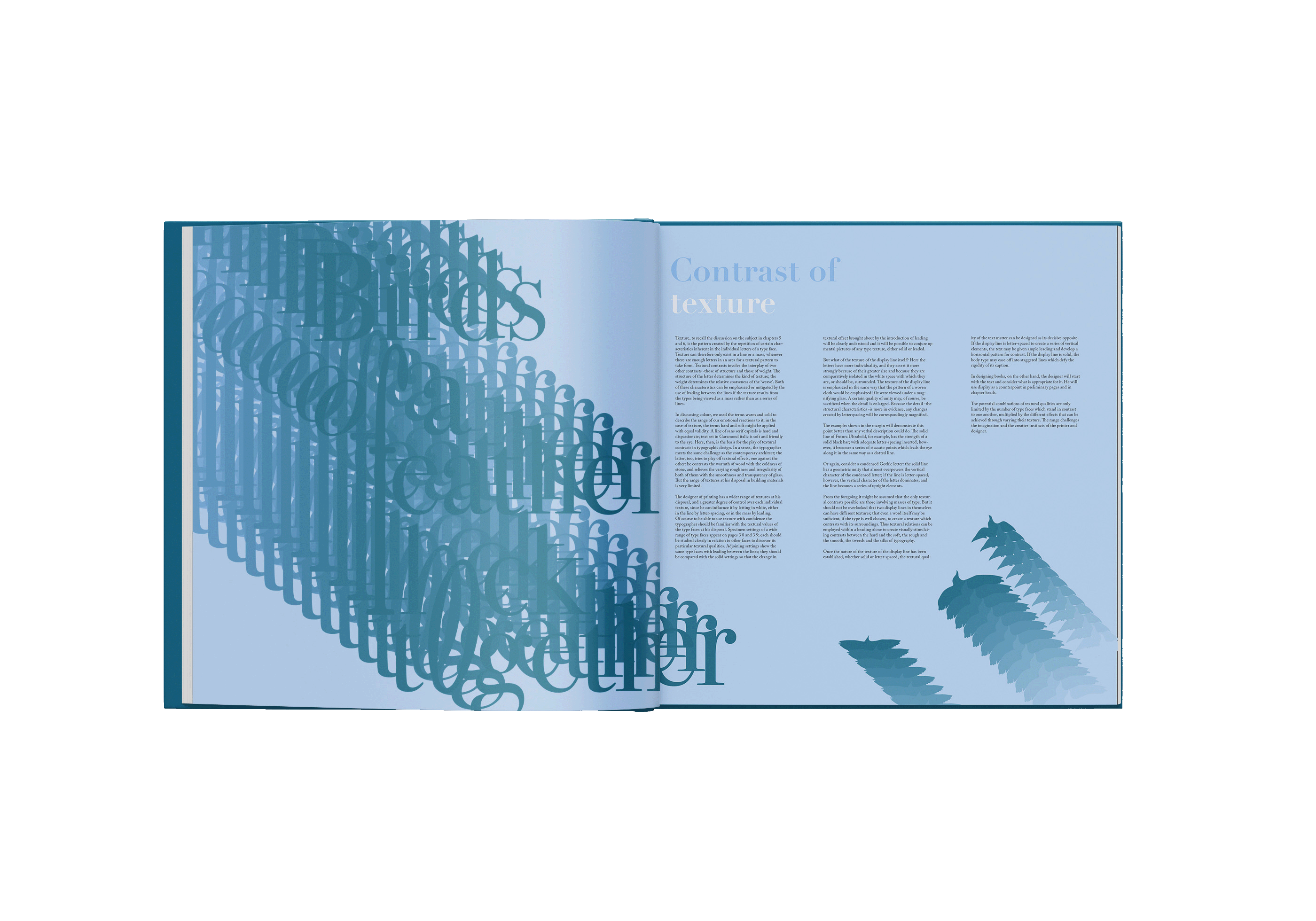
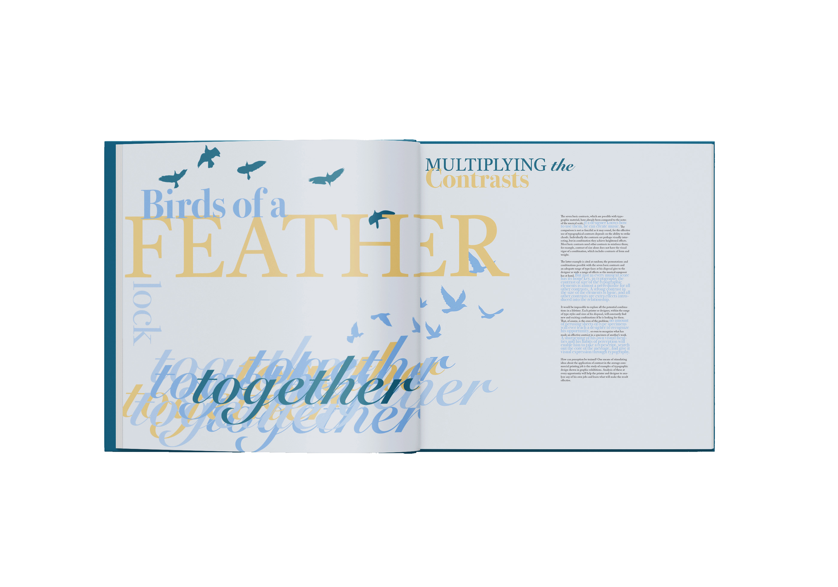
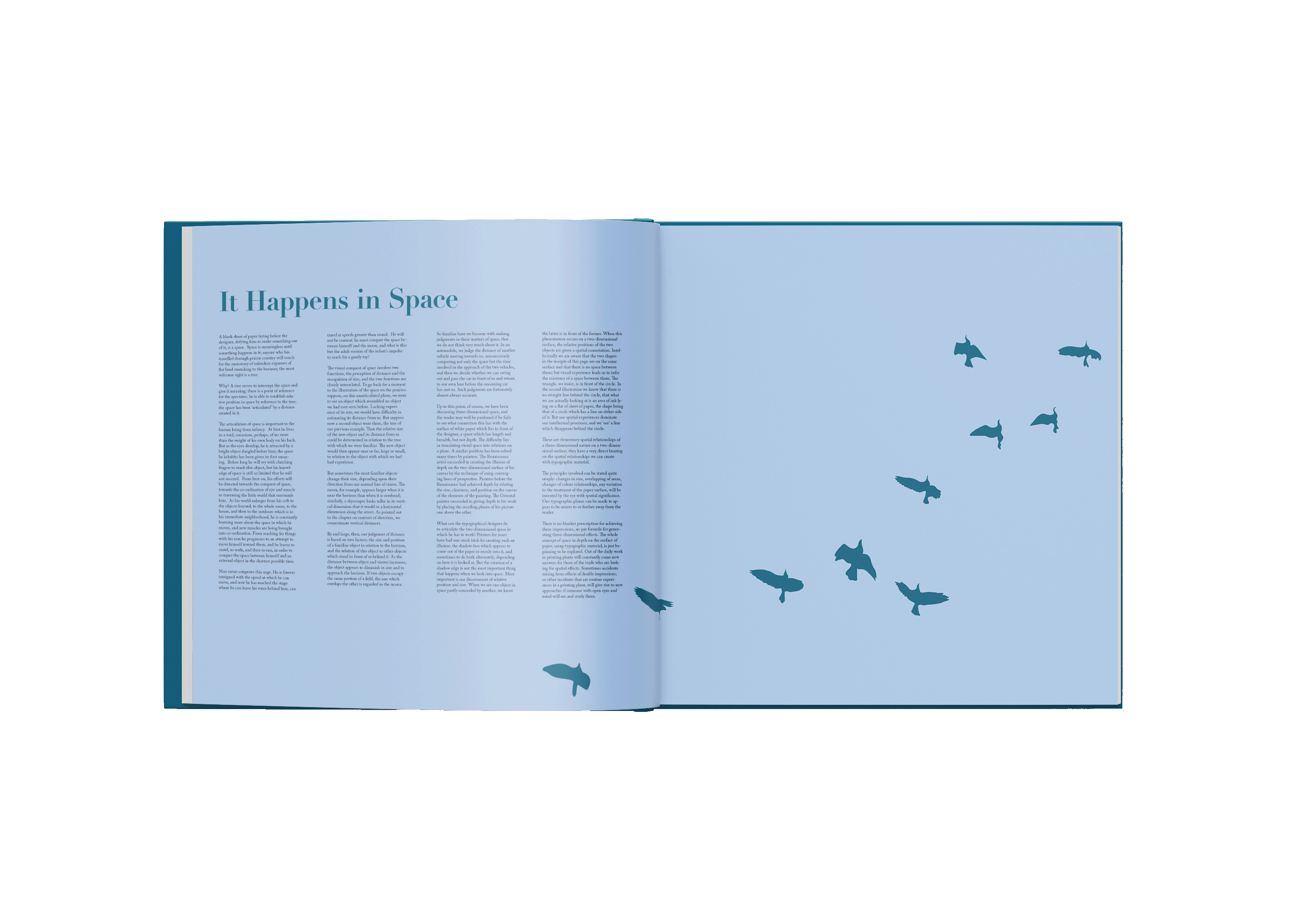
This redesign of Design With Type by Carl Dair brings new life to a timeless exploration of typography through a fresh, cohesive visual language. A cool, sophisticated blue color scheme anchors the design, evoking clarity, creativity, and structure, core qualities of effective typography.
Bird motifs are thoughtfully integrated throughout the cover and interior, visually tying back to the guiding phrase, "birds of a feather flock together." This metaphor illustrates Dare’s principle that typefaces, when thoughtfully selected and grouped, create powerful, harmonious compositions. Minimalist bird silhouettes, simple yet expressive, interact with typographic elements on the page, demonstrating balance, rhythm, and flow without overwhelming the educational content.
The layout is clean and spacious, with type examples carefully "flocking" in natural groupings that reinforce the visual metaphor. Pops of lighter blues and soft gradients add depth without distracting from the core material, while the overall aesthetic remains modern, disciplined, and accessible, a fitting tribute to Dare’s vision of type as both art and craft.
Click here to view the book in full.


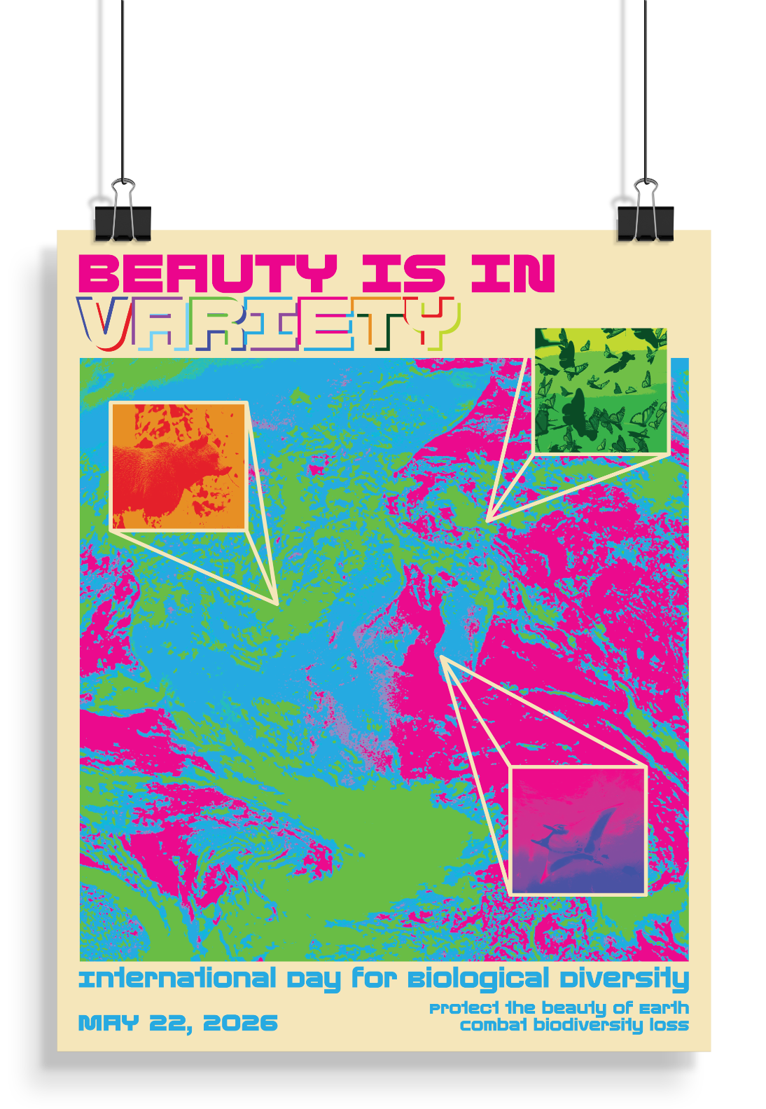
This environmental awareness poster began as a celebration of biodiversity and was meant to highlight the urgency of protecting ecosystems, and evolved into an advertisement for the International Day for Biological Diversity on May 22. The shift in focus allowed the message to move from general awareness to a specific call for recognition and collective action, grounding a global issue in a concrete moment on the calendar.
The poster employs the overwhelm the eye technique from Ellen Lupton’s How Posters Work, using dense imagery, saturated color, and layered visual elements to immerse the viewer. A range of animal forms layered over a satellite image of Earth compete for attention within the composition. The visual excess is intentional, by crowding the frame the poster communicates both abundance and fragility, prompting viewers to consider what is at stake if biodiversity continues to decline. Rather than guiding the eye calmly through the layout, the design demands sustained looking, mirroring the scale and urgency of the environmental crisis it addresses.