
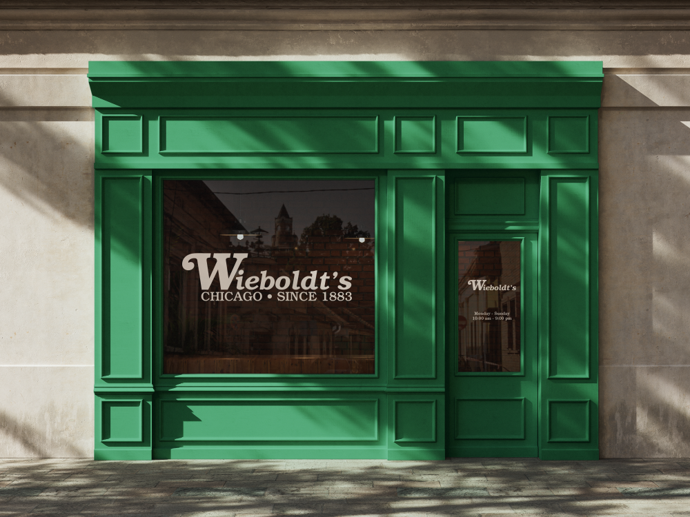
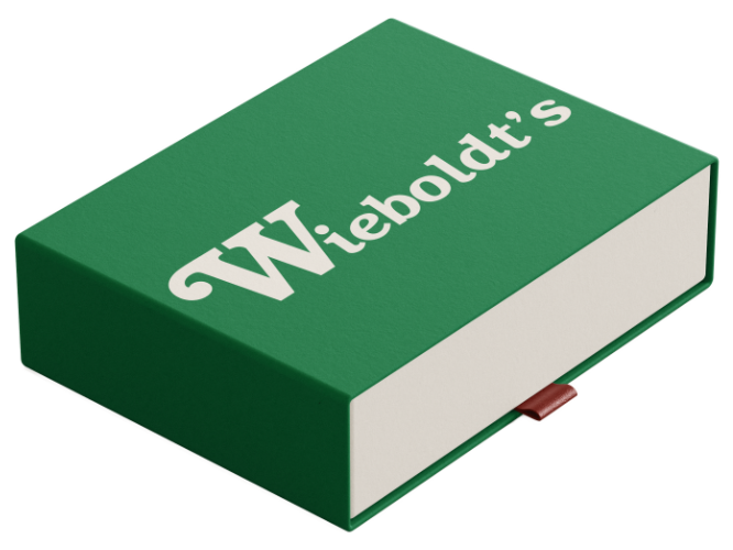
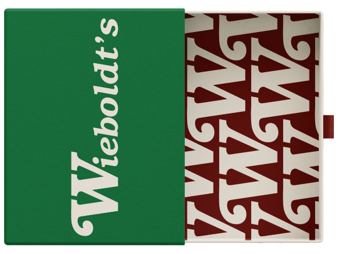
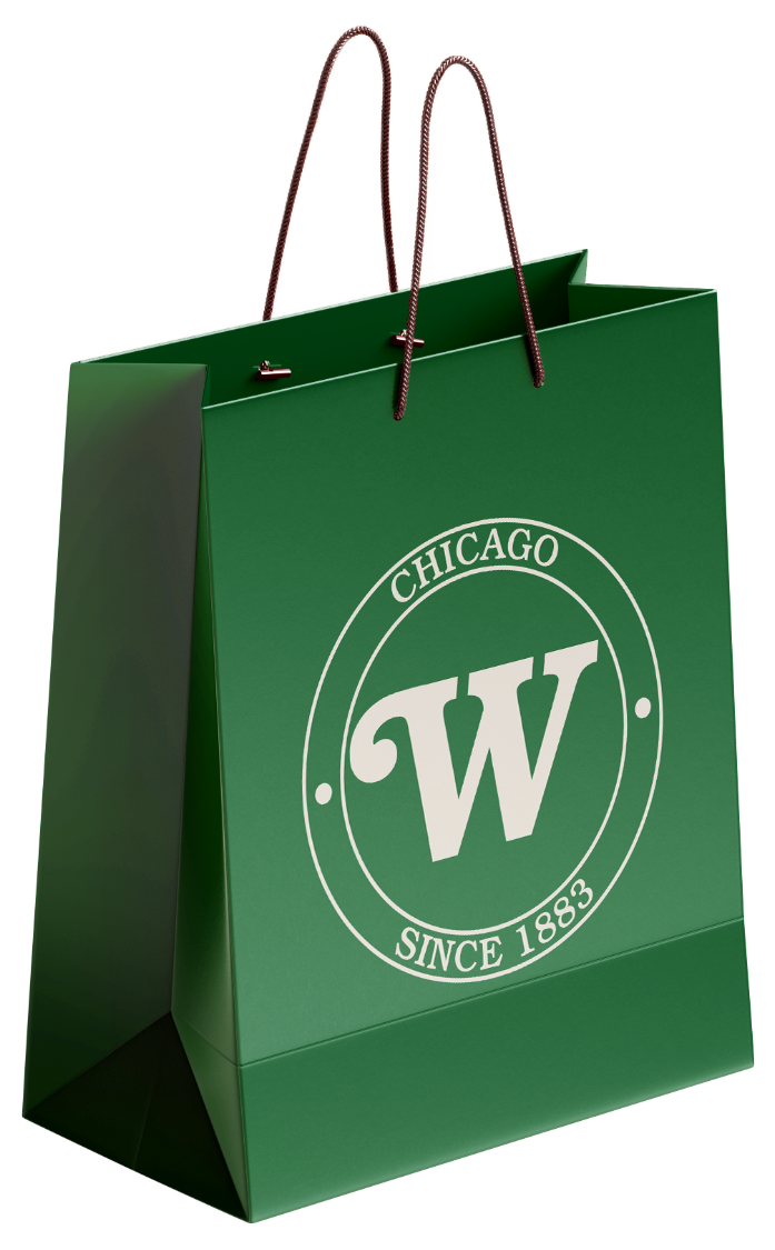
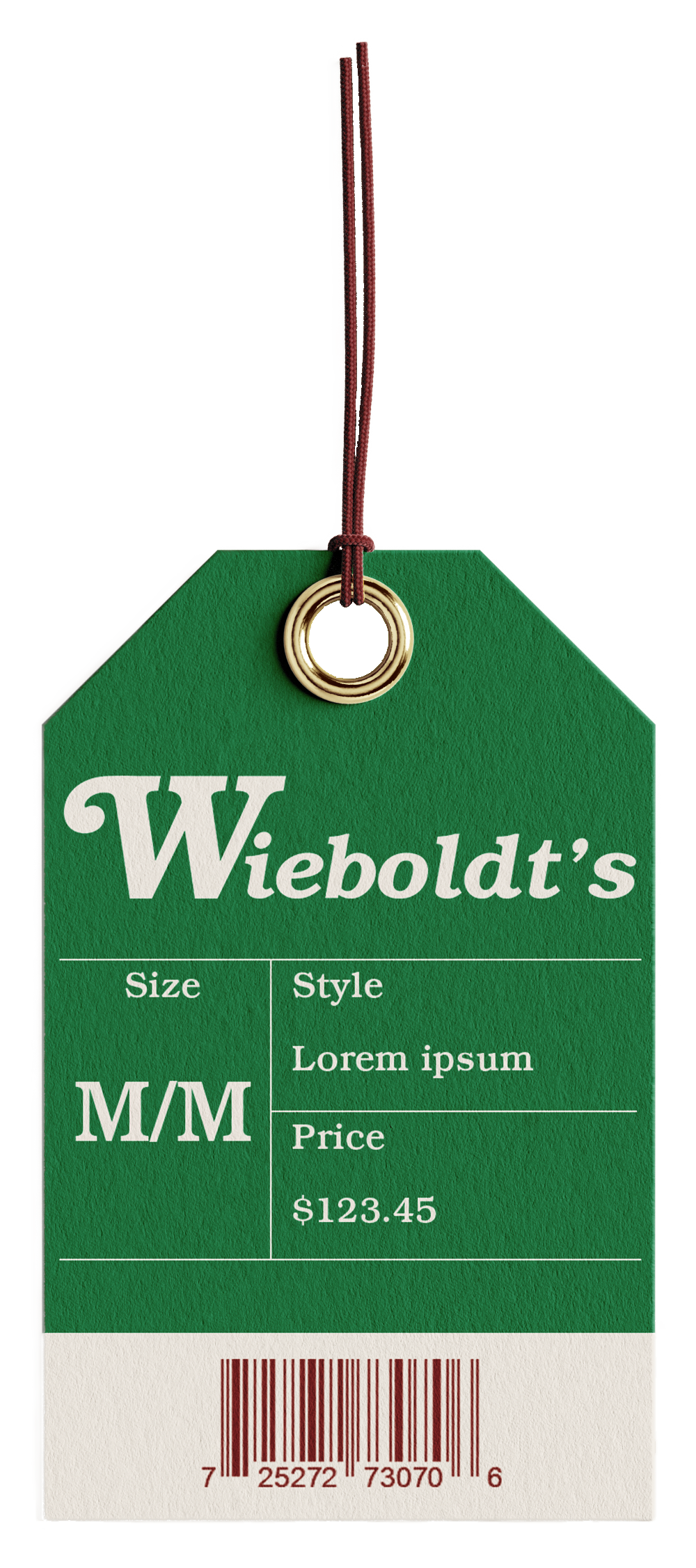
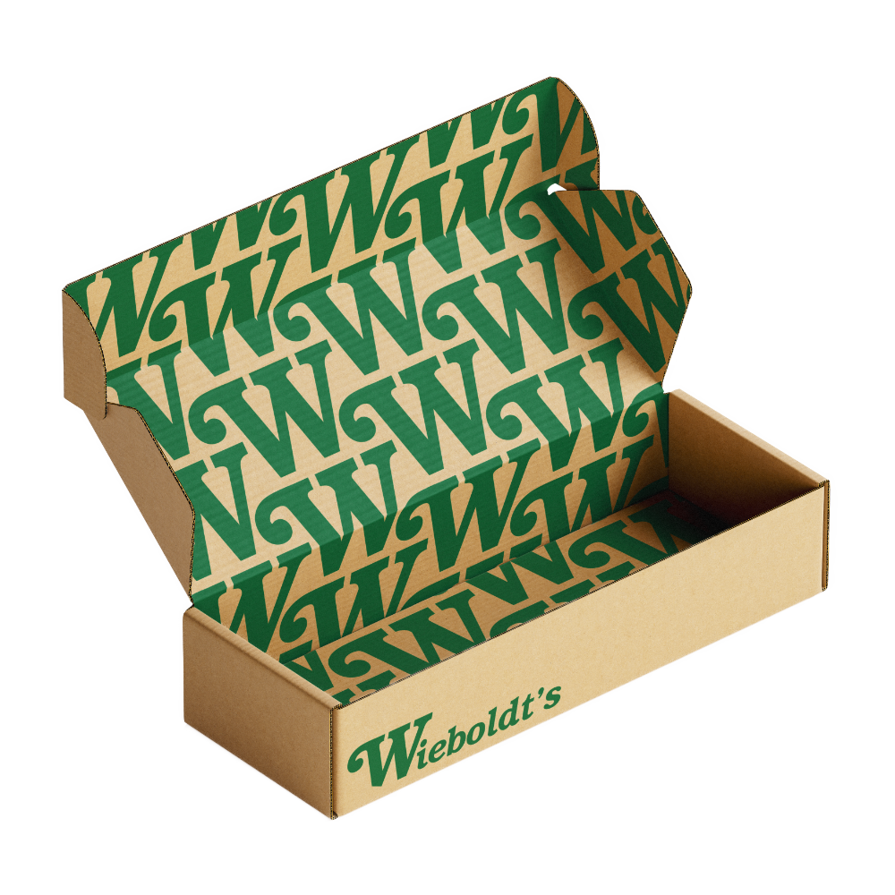
This project reimagines the identity of Wieboldt’s, the defunct Midwestern department store chain, with the goal of honoring its legacy while positioning it as a modern heritage brand. The redesign focuses on updating the logo and visual system to feel timeless, refined, and relevant in the 21st century, bridging nostalgia with contemporary sensibilities.
Drawing from Wieboldt’s history as a trusted, community-centered retailer, the new identity emphasizes attainable luxury. Elevated but welcoming, classic yet approachable. Typography, color, and form were carefully considered to evoke confidence, craftsmanship, and longevity without feeling exclusive or out of reach. The result is a brand that feels rooted in tradition while resonating with today’s everyday consumer, reviving Wieboldt’s as a department store that values quality, accessibility, and enduring style.
Click here to view the standards manual.


The logo for St. Louis Bagel Co. is a clean, contemporary wordmark that captures the spirit of the city and the comfort of a freshly toasted bagel. The design features bold, rounded typography with a playful twist - a small, stylized bagel icon tucked into the counter of the lowercase "g." This subtle detail adds personality while instantly conveying the brand's core offering.
The color palette blends a deep, toasted orange inspired by the perfect bagel crust with a rich, dark blue drawn directly from the St. Louis city flag as a nod to local pride and authenticity. Together, these colors create a striking and memorable contrast that feels both modern and rooted in tradition.
This versatile identity works seamlessly across applications, from cart signage and menus to merchandise and digital media, ensuring that St. Louis Bagel Co. is always serving up strong visual flavor alongside its signature baked goods.


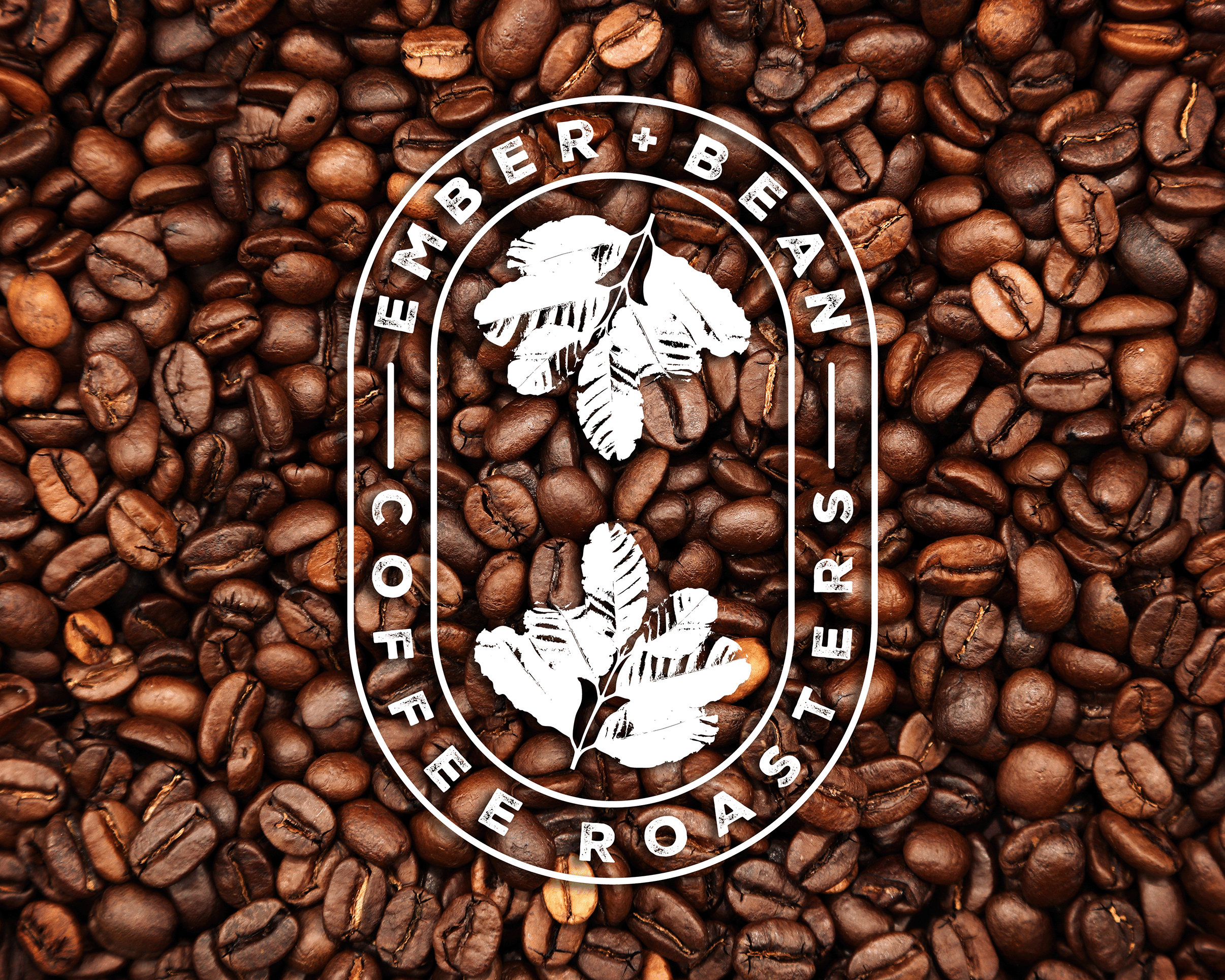
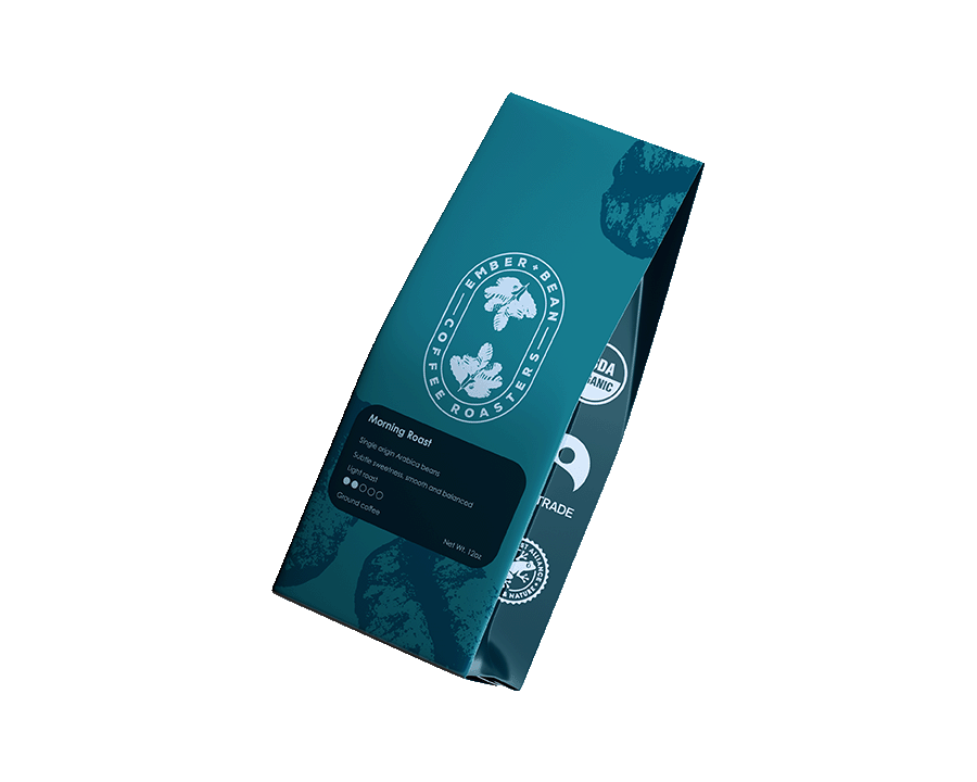
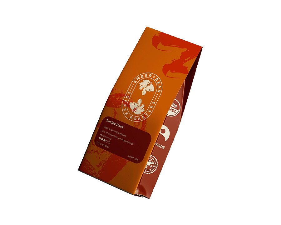
The logo for Ember and Bean Coffee Roasters evokes warmth, craftsmanship, and a connection to the origin of every bean. Built around an ovular, badge-style design, the logo features two central coffee plant leaves as a nod to the agricultural roots of coffee and the brand's commitment to quality sourcing.
Surrounding the leaves, the brand name wraps in a clean, vintage-inspired type. The entire mark is given a weathered texture, adding a tactile, time-worn look that speaks to hand-roasted tradition and a deep appreciation for the process.
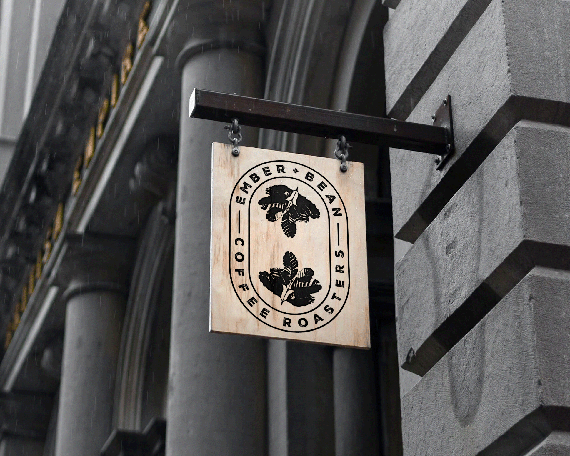
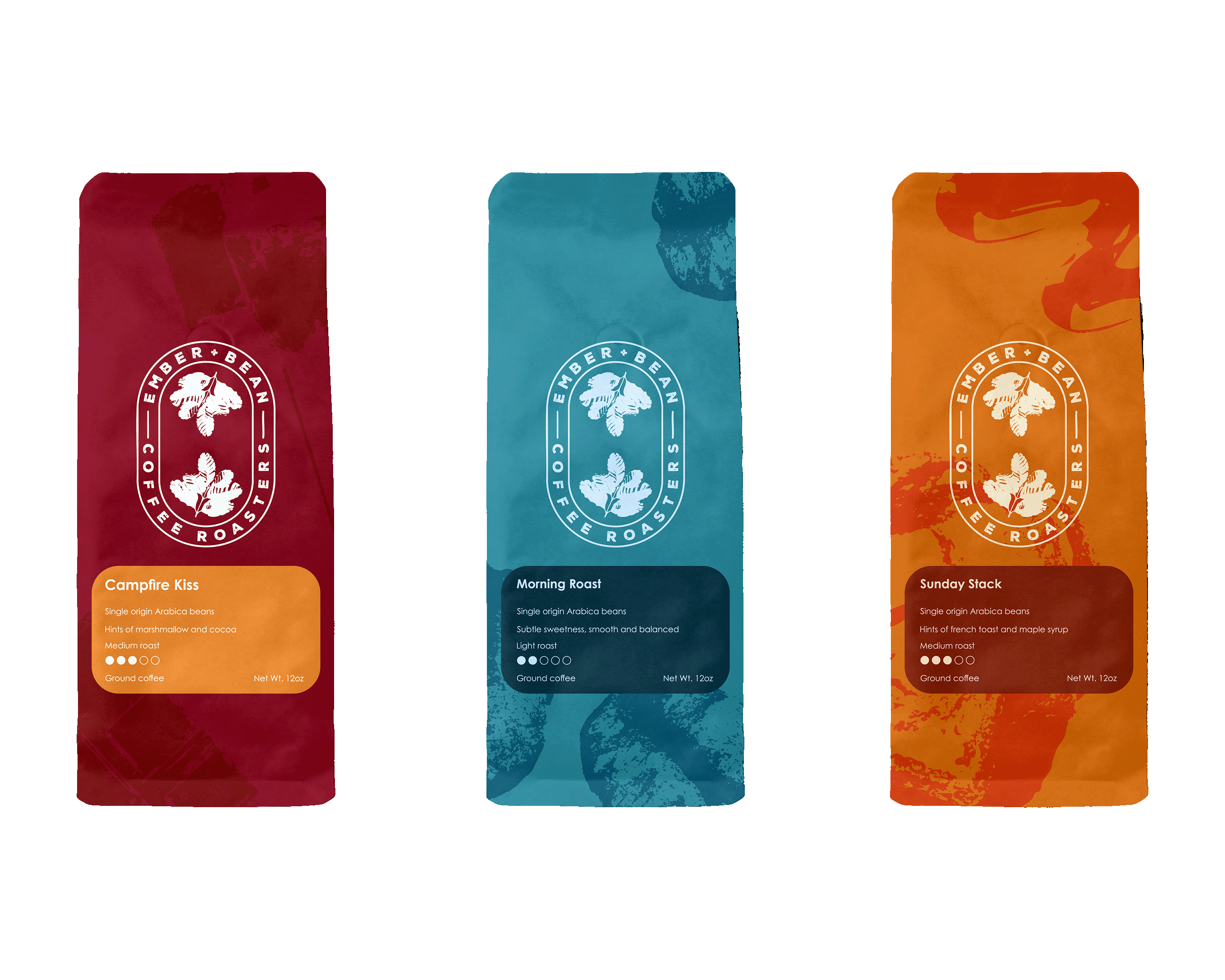
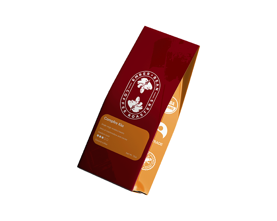
With its classic shape and rugged charm, the logo feels at home on everything from stamped coffee bags to enamel mugs and outdoor signage, perfect for a brand that blends nature, fire, and flavor into every roast.


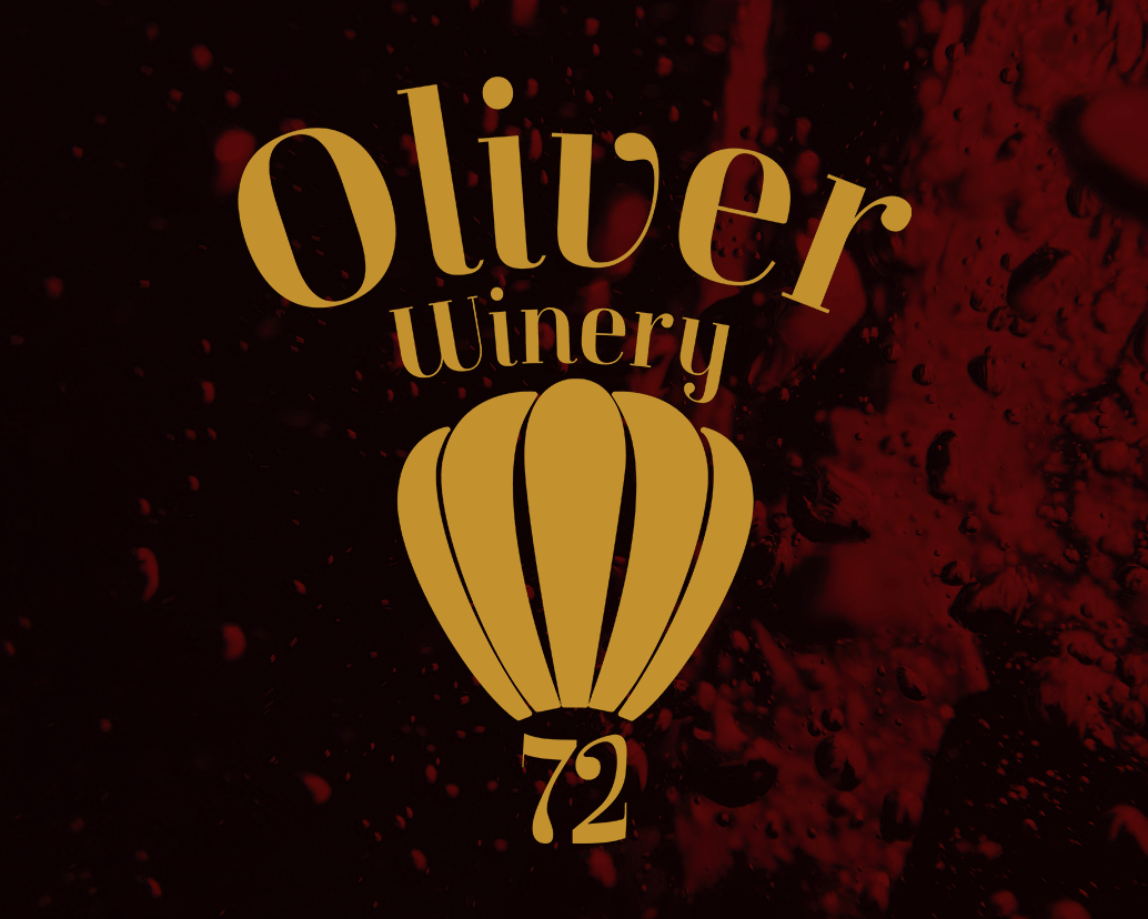
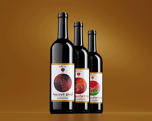
The redesigned logo for Oliver Winery honors the brand's rich heritage and adventurous beginnings, capturing founder William Oliver's fun-loving spirit and life-long appreciation for hot air balloons. At the heart of the design is an elegant, abstracted balloon motif, a symbol of joy, discovery, and elevation, which ties into the brand's constant exploration of new and unique wine flavors.
The typography is sophisticated yet welcoming, balancing clean lines with graceful flourishes that suggest both approachability and prestige. The warm gold of the logo invokes a feeling of luxury and maintains the brand's status as a maker of fine wines.
This refreshed identity reimagines Oliver Winery not just as a destination for great wine, but also as an invitation to savor life's celebrations, big and small, with a glass in hand and a spirit ready to soar.
